
Qlik Sense Business Analyst Certification Exam-2024
Last Update Jun 24, 2026
Total Questions : 50
We are offering FREE QSBA2024 Qlik exam questions. All you do is to just go and sign up. Give your details, prepare QSBA2024 free exam questions and then go for complete pool of Qlik Sense Business Analyst Certification Exam-2024 test questions that will help you more.


A business analyst is creating an app for the sales team. The app must meet several requirements:
• Compare 10 top-performing sales representatives and the amount of sales for each
• Investigate margin percentage and total sales by each product category
• View distribution of sales amount
Which visualizations should be used for this app?
A company has sales data where every Customer ID can be assigned to one or more Sales Account ID. Sales Accounts are assigned to one of eight Groups. The business analyst is creating an app with the following requirements:
• Each Group should have a separate sheet
• The Sales Account can only see its own customers
• The Sales Account can navigate only to the sheet for the Group assigned
The business analyst has created a Section Access table, in which each Sales Account ID is assigned their CustomerlDs. Which action should the business analyst take next?
A business analyst is building an app to analyze virus outbreaks. They create a bar chart using a dimension of Continent, and a measure of Sum (Knowningsections). They require a secondary bar on the chart, so they create a second measure using Count (MajorCities).
The bar chart adjusts, but no bars are visible for this second measure. Which action should the business analyst take to resolve this issue?
A customer needs to demonstrate the value of sales for each month of the year with a rolling 3-month summary. Which visualization should the business analyst recommend to meet the customer's needs?
A project management team uses an app to monitor different projects.
• Projects may have co-dependent tasks and processes
• Some projects include subtasks
The business analyst needs to use a diagram similar to a workflow with the processes and the sub tasks represented as boxes with lines to relate them to each other. The color of the boxes could also be determined by the status of each project or task.
Which visualization should be used?
A business analyst receives an image of a dashboard from the HR Director and is asked to recreate the image in Qlik Sense. The image shows charts for:
• Company employee structure
• Average employee salary by region
• Geographical representation of office capacity
• Company retention over time
Which charts will meet these analysis requirements?
Refer to the exhibit.
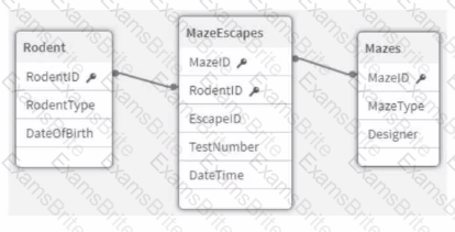
An app that will track experiments for rodents (e.g., rats and mice) that navigate mazes (labyrinths) is being developed. Individual rodents are catalogued in the Rodent table, while the Mazes table has metadata for the mazes. The MazeEscapes table holds a record of each attempt at a maze by a rodent. A business analyst needs to build a KPI that will allow users to see how many rodents have made at least one attempt at any maze.
How should the analyst construct the KPI?
The VP of Sales asks a business analyst to include a KPI object on the sales dashboard that shows total sales value for the year 2022, regardless of selections. Existing fields in the data model include Sales and Year.
How should the business analyst write the measure for the KPI object?
A business analyst needs to create two side-by-side charts for a sales department with the following data:
• Number of orders
• Name of the customer
• Percentage of margin
• Total sales
The charts use a common dimension, but each chart has different measures. The analyst needs to create a color association between the two charts on the dimension values.
Which action should the business analyst take?
A banking organization needs a dashboard that shows the following:
• A KPI indicator for current year (CY) versus last year (LY) revenue
• A scatter plot that shows the cost versus revenue of product categories
• A treemap that shows average customer satisfaction rating based on regions
• A table that shows CY cost by record number, financial instrument, and bank
In addition to the customer satisfaction rating, which fields should be used to create the required measures?
A business analyst using a shared folder mapped to S:\488957004\ receives an Excel file with more than 100 columns. Many of the columns are duplicates. Any current columns that should be used have the suffix '_c' appended to the column name.
Which action should the business analyst take to load the Excel data?
A dashboard developer finishes creating a supply chain analysis app and is presenting it to leadership for review. The landing page shows four visualizations including:
• Bar chart showing available supply by product category
• Line chart showing total cost of deliveries to the warehouse by month-year
• Scatter plot showing cost of delivery and time-to-deliver by product
• A map that shows the volume of delivery from suppliers to warehouses using a line layer
Leadership asks the developer how they can see the total cost of delivery overall. How can the analyst show this information to leadership?
A company CFO has requested an app that contains visualizations applicable to analyzing the finance data. Each regional finance team will analyze their data and should only have access to the data in their region. The app must contain a high-level sheet that navigates to relevant detail sheets.
Which features support a logical design structure?
A business analyst is creating an app using a dataset from ServiceNow. The dataset shows information about support cases, including how many days it has been since the case was opened (age).
The app requirements are:
• The dashboard must display support cases in categories based on the age (New, Aging, and Beyond Service Level Agreement)
• The categories will be used multiple times in the dashboard
• Given the volume of support cases, it is expected that the dataset will grow to be very large
Which solution is the most efficient way for the business analyst to create this app?
A business analyst has access to all of a company's data for the past 10 years. The source table consists of the following fields: TransactionID, TransactionTime, Transaction Date, Transaction Year, Cardholder, Cardholder address, Cardissuer, and Amount.
Users request to create an app based on this source with the following requirements:
•Users only review the data for the past 2 years
•Data must be updated daily
•Users should not view cardholder info
Which steps should the business analyst complete to improve the app performance?

TESTED 24 Jun 2026