Salesforce Certified Tableau Data Analyst
Last Update Oct 12, 2026
Total Questions : 212
We are offering FREE Analytics-DA-201 Salesforce exam questions. All you do is to just go and sign up. Give your details, prepare Analytics-DA-201 free exam questions and then go for complete pool of Salesforce Certified Tableau Data Analyst test questions that will help you more.



Which function should a Data Analyst use to average sales at a less-granular level of detail than is in the view?
A Data Analyst has the following two tables that contain data about the books in a library.
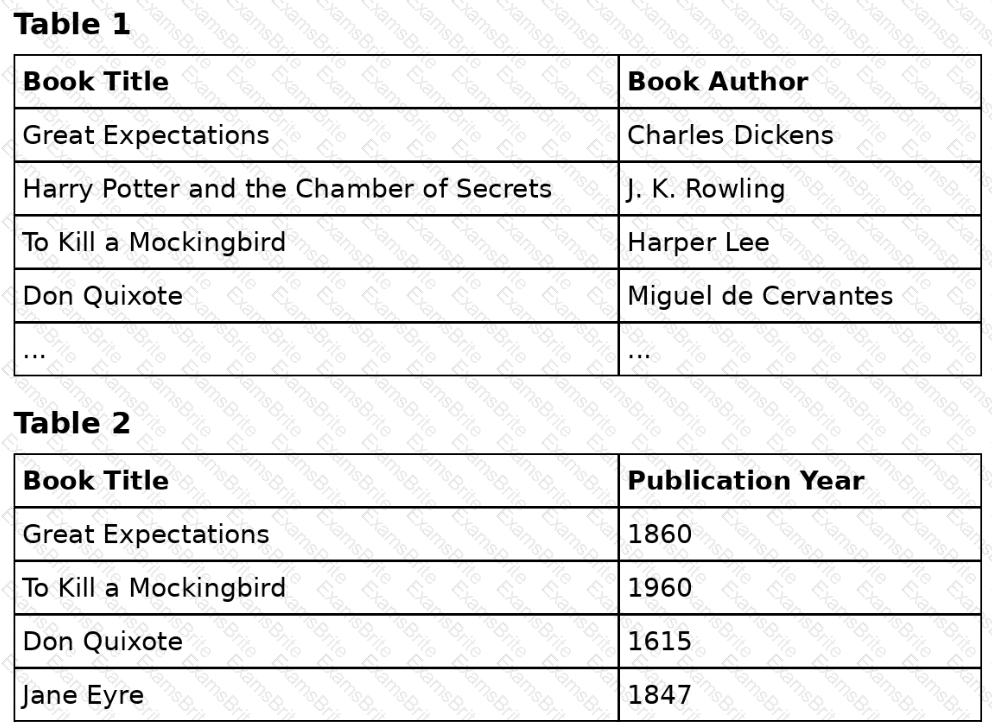
Both tables are incomplete, so there are books missing from the tables.
The analyst needs to use the data from both tables in a single sheet. The solution must ensure that all the data is retained.
How should the analyst connect these tables?
You have a Tableau workbook that has a live data source. The data source connects to a Microsoft SQL Server database. Only the users in your department can access the database.
You plan to publish the workbook to a Tableau Server site named Public. All the users in your company can access Public.
What are two ways to ensure that all the users can view the worksheets in the workbook? Choose two.
A Data Analyst has a website that displays data in a table format.
The analyst wants to connect to the data of the website by using the least amount of effort.
What should the analyst use to connect to the data?
The following table displays the row-level data in a Tableau data source:
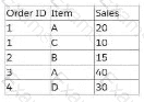
A Data Analyst creates this calculated field:
SUM(IF [Item] = ' A ' THEN [Sales] END) / COUNT([Order ID] )
What is the result of this aggregate calculation?
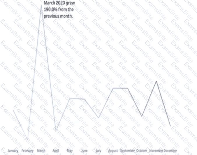
You want to add a comment to March 2020 as shown in the following visualization.
You have the following sets in a Tableau workbook
• Top N Customers
• Customers of 2020
• Top N Products
• Sellers of 2020
Which two sets can you combine? Choose two
What is required to publish a data source to Tableau Server or Tableau Cloud from Tableau Desktop?
A Data Analyst has the following chart.
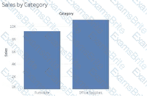
The analyst needs to enable the drilldown from Category to Subcategory as shown in the following chart.
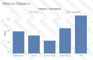
What should the analyst create?
You have the following dataset.
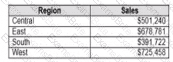
Which Level of Detail (LOD) expression should you use to calculate tie grand total of all the regions?
Which function should a Data Analyst use to aggregate total regional sales for a dataset regardless of what is in the view?
You have the following dataset:
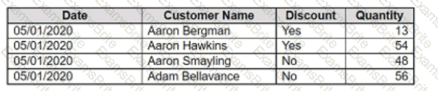
You want to create a parameter to dynamically filter the data to produce the following results.

Which two types of parameters can you use to produce the results? Choose two.
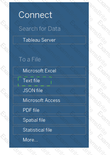
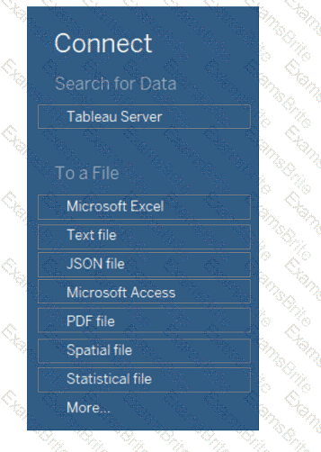
You receive a tab-delimited data file name sales.tsv.
You need to connect to the file.
Which option should you select in Tableau Desktop?
A Data Analyst has a dataset that contains the fallowing rows of sales data.
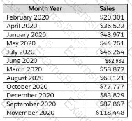
The analyst needs to return a value of TRUE if a month has sales greater than $50,000; otherwise, the formula must return a value of FALSE.
Which two formulas achieve this goal? (Choose two.)
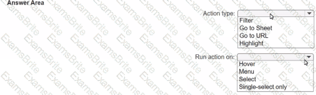
You have the following dashboard.
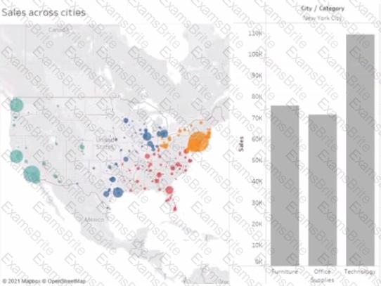
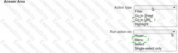
When a user selects a only on the map the data on the bar chart must show only the data for the selected city. The data in the bar chart must change only when the user selects a different city How should you configure the dashboard action? (Use the dropdowns in the Answers Area to select the correct options.)
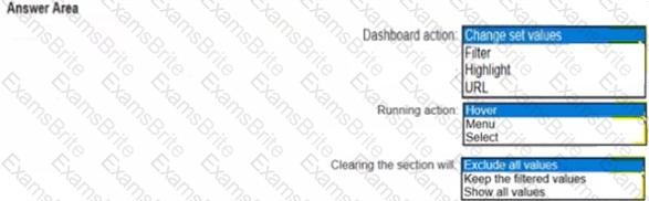
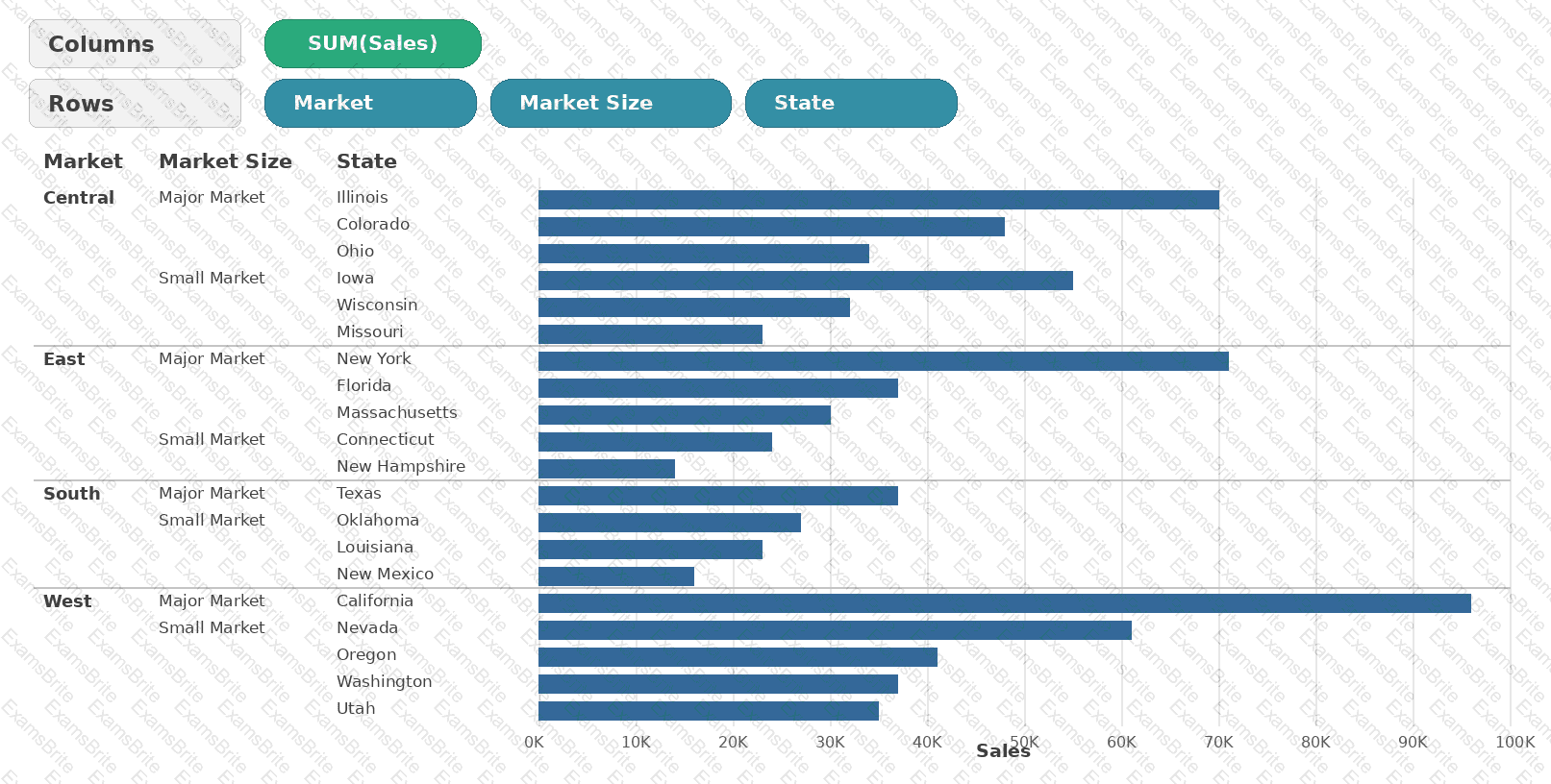
A Data Analyst has the following worksheet in a dashboard that has a hierarchy from Market to Market Size in the view.
A stakeholder wants to see the total sales for each Market/Market Size depending on which hierarchy level is in the view.
Which calculation should the analyst use to get the Market and/or Market Size total?
A colleague provides you with access to a folder that contains the following files:
• Sates.csv
• Bookl.twb
• Sates.hyper
• Export.mdb
Which He contains an extract?
You are creating an annual report in Microsoft Word.
In Tableau Desktop, you build a chart in a worksheet.
You want to create an image of the chart that you can add to the annual report.
What are two ways to create the image? Choose two.
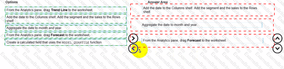
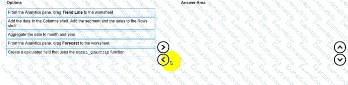
You have a dataset that contains daily sales by business segment from 2017 to the present
You want to use monthly historical trends to predict sales by segment in the future
Which three actions should you perform m order?
(Place the three correct options in order Use the arrows to move Options lo Answer Area I In Answer Area arrows to re order the options.)
You have the following worksheet.
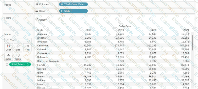
You want to create a table calculation that shows sales growth over each year.
How should you complete the formula? (Use the dropdowns in the Answer Area to select the correct options to complete the formula.)

A Data Analyst has a dataset that contains people and the awards they have won.
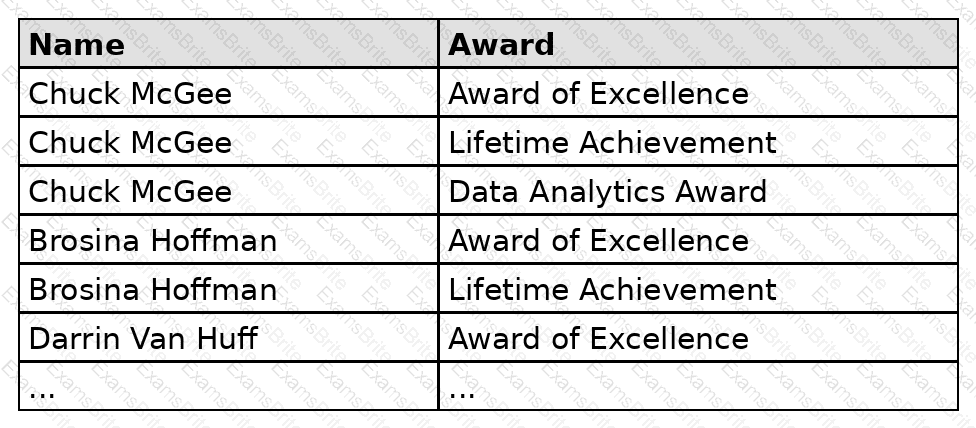
Which formula should the analyst use to get the number of people who won an award?
You create a worksheet named Sales by Region and hide the tide of the worksheet. You print the worksheet as a PDF and notice that the worksheet title appears. You need to prevent the title from appearing when you print the worksheet as a PDF. Which settings should configure from the File menu in Tableau Desktop?
You have the following dataset:
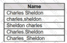
Which grouping option should you use in Tableau Prep to group all five names automatically?
A Data Analyst has the following dataset.
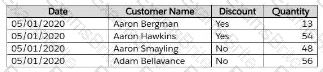
The analyst wants to create a parameter to dynamically filter the data to produce the following results based on quantity being above X value.

Which two types of parameters should the analyst use to produce the results? (Choose two)
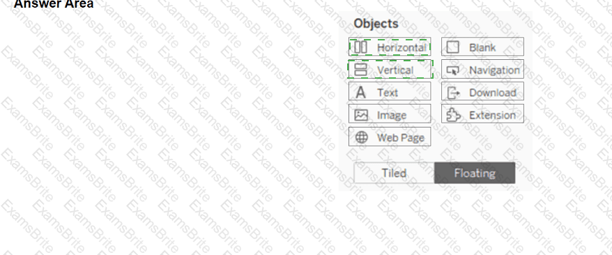
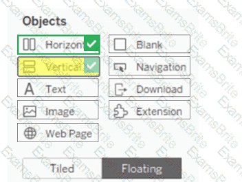
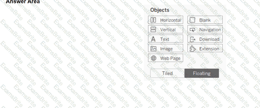
You have a blank dashboard.
You want to add two sheets to the dashboard. The sheets must support the Show/Hide button.
To which two objects can you add the sheets? (Click the two appropriate Options in the Answer Area.)
You publish a dashboard tut uses an attract. The extract refreshes every Monday at 10:00.
You need to ensure that the extract also refreshes on the last day of the month at 18:00.
What should you do?
A Data Analyst has a large data source that contains more than 10 million rows. Users can filter the rows by a field named Animal.
The following is a sample of the data.
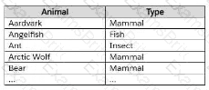
The analyst wants to ensure that every calculation is affected by including only animals of a particular type.
Which type of filter should the analyst create on the worksheet?
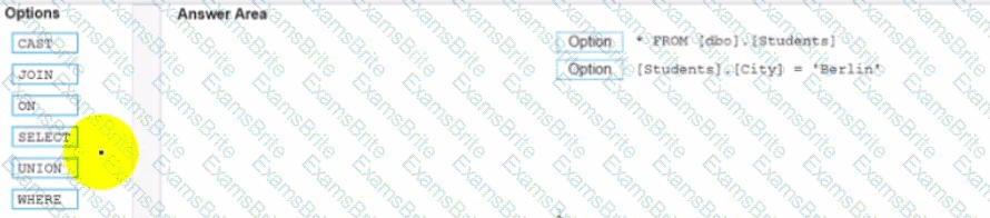
You conned to a Microsoft SQL Server database
You need to create a custom SQL query that retrieves rows from a table named Students Only students m the city of Berlin must be returned
How should you complete the query? (Drag the appropriate Options to the Answer Area and drop into the correct locations.)
You have a data source that contains 20 tables.
You want the tables to be organized within the Data pane based on the type of data contained within the tables.
What should you use?
How should a Data Analyst implement row-level security to ensure secure access to a published data source for viewers and explorers?
In a dataset, you have a string field named Name that contains unnecessary semicolons.
Which function should you use to remove the semicolons from the Name field?
You have a dashboard that contains a parameter named Start Date.
You need to create an extract from a Microsoft Excel file. The extract must be filtered based on Start Date.
What should you do?
You have the Mowing two tables that contains data about the books in a library.

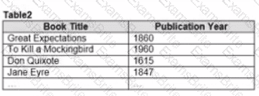
Both tables are incomplete so there are books missing from the tables.
You need to combine the tables. The solution must ensure that all the data is retained
Which type of join should you use?
A Data Analyst is building a dashboard and wants to allow users to select which measure is being shown on one of the charts.
Which type of action should the analyst use to accomplish this?
A Data Analyst wants to visualize the distribution of employee salaries across a large corporation. The analyst needs to divide the salary range into equal intervals for better analysis and presentation.
What should the analyst create to implement this in Tableau?
A Data Analyst has the following primary data source that contairis a dimension named Dorm_Code.
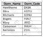
The analyst receives the following secondary data source that contains updated dorm codes.
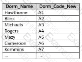
The analyst needs to bring the updated dorm codes into Tableau and use the codes in existing visualizations. The new dorm codes must use the existing field name of Dorm_Code.
What should the analyst do?
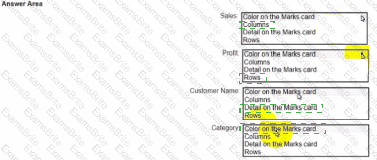
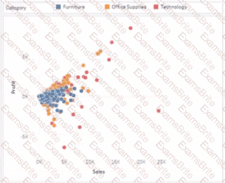
You have a dataset that has four fields named Category. Profit Sates and Customer Name. You need to create the following visualization.
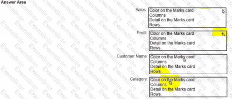
You have the following dashboard.

Currently the map is used as a filter that affects the data on the otter sheets of the dashboard
You need to configure the dashboard to ensure that selecting a data point on the map only tillers the Detail table
What should you do?
You are subscribed to several views.
You need to unsubscribe from the views.
What should you use?
A Data Analyst has the following dashboard.
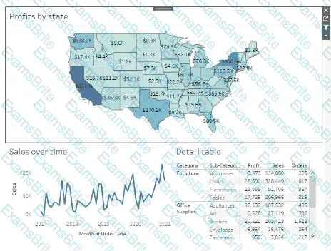
Currently, the map is used as a filter that affects the data on the other sheets of the dashboard.
The analyst needs to configure the dashboard to ensure that selecting a data point on the map only filters the Detail table.
What should the analyst do?
A Data Analyst at a coffee company has the following visualization already built.
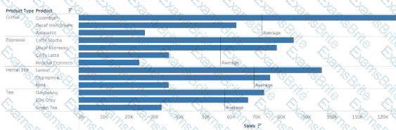
The analyst wants to make this more visually appealing by coloring the bars based on whether they are above or below the Average Sales within each Product Type.
Which calculation should the analyst use to calculate the Average Sales for each Product Type?
You have the following dataset.
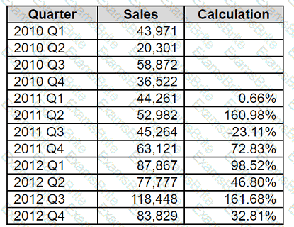
Which formula calculates the percent difference in sales relative to the same quarter the previous year as shown in the Calculation field?
A Data Analyst has two tables named EmployeeInfo and DepartmentInfo. EmployeeInfo contains four fields named Full Name, Department ID, Start Date, and Salary. DepartmentInfo contains four fields named Department Name, Size, Department ID, and VP. The analyst wants to combine the tables to meet the following requirements:
EmployeeInfo is the first table that is dragged to the canvas,
The records must contain the Full Name, and the Department Name, Size, and VP fields if available,
Not all records have an exact match.
Which type of join should the analyst use?
A Data Analyst is creating a map that includes multiple data layers at country, state, and city levels. Users want to customize their map by turning layers on and off as needed.
How should the analyst provide this functionality?
You have the following dataset.

You need to generate the results in the Day field.
How should you complete the formula? (Use the dropdowns in the Answer Area to select the correct options to complete the formula.)

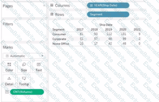
You have the following visualization.
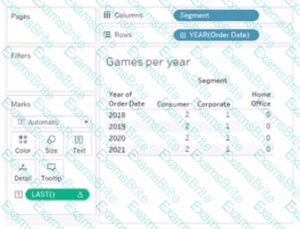
The Last() calculation is set to compute using Table (across)
Which value will appear in the crosstab for the Consumer segment of the year 2018 if you change compute to use Oder Dale?
A Data Analyst has the following chart that shows the sum of sales made in different cities.
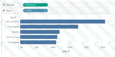
The analyst wants to show the average sale amount for a city when users hover their mouse over any of the bars.
What should the analyst do?
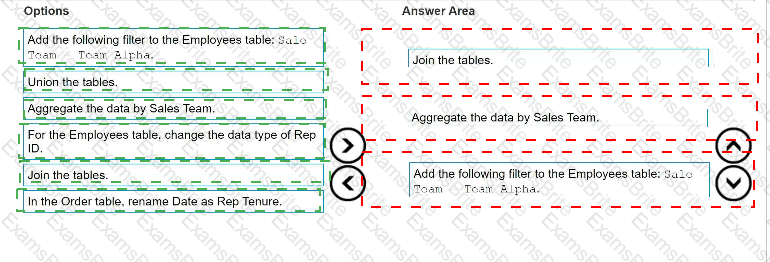
You are developing a data source in Tableau Prep.
You have two tables named Orders and Employees.
The Orders table was created in 2019 and contains the following columns.

The Employees table contains all the employee information for the various sales teams in the sales department and contains the following columns

You want to prepare the data so that you can analyze sales trends over time for every sales team.
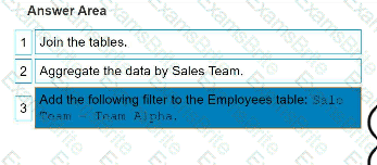
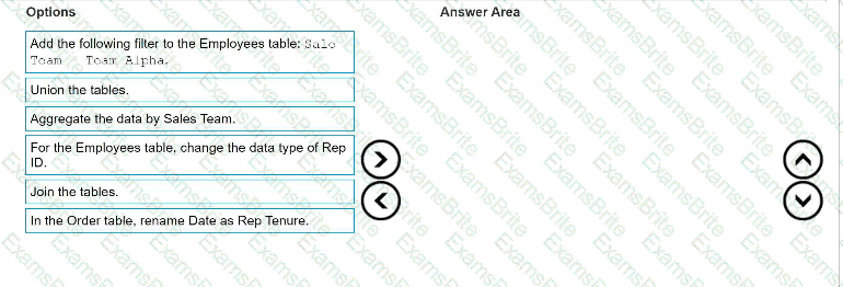
Which three actions should you perform in order? (Place the three correct options in order. Use the arrows to move Options to Answer Area. Use Answer Area arrows to re-order the options.)
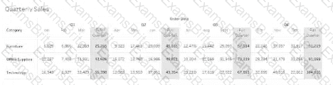
Which option must a Data Analyst enable to build the following table to add quarterly totals?
You have a Tableau workbook that contain three worksheets named Sheet1 Sheet2 and Sheet3.
You create several filters.
From the Data Source page you plan to add data source fillers
When type of filter will appear in the Edit Data Source Filters dialog box?
You have a line chart on a worksheet.
You want to add a comment to March 2020 as shown in the following visualization.
What should you do?
Which attributes are required for the field that is used to hide or show an object with Dynamic Zone Visibility?
You are the owner of an alert.
You receive an email notification that the alert was suspended
From where can you resume the suspended alert?
A Data Analyst has the following dataset.
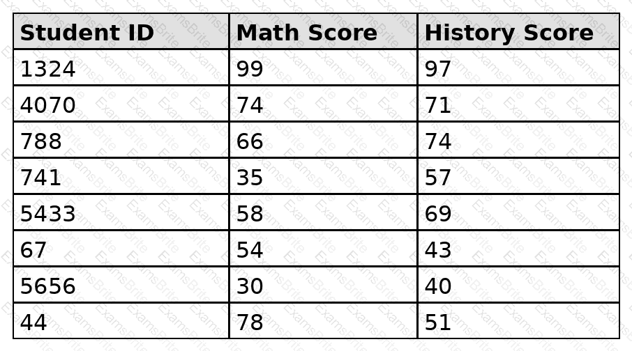
The analyst needs to analyze the relationship between math scores and history scores as shown in the following exhibit.
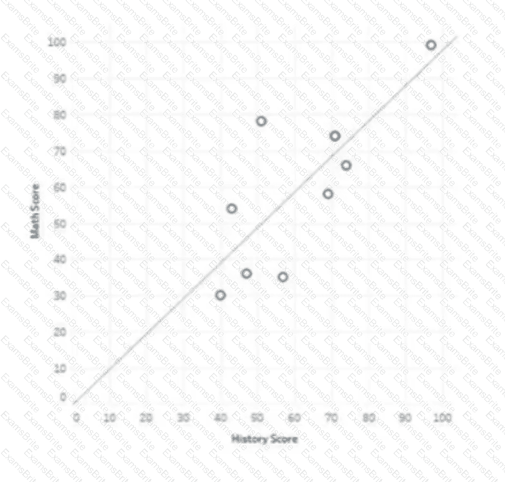
Which three actions should the analyst perform? Choose three.
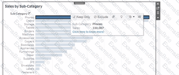
You want to ensure that when you click a bar on a dashboard, a tooltip appears that contains a link named " Click here to know more! " as shown in the following exhibit.
A Data Analyst has the following table.
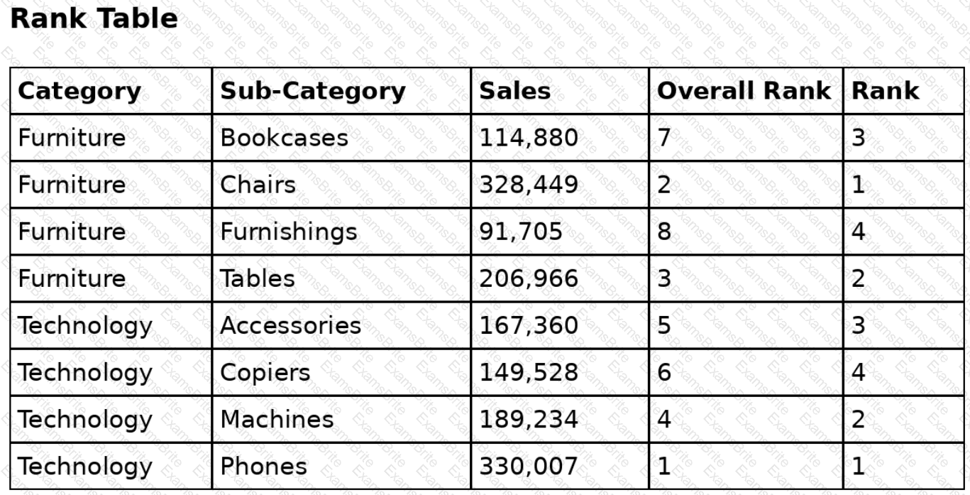
Overall Rank and Rank are calculated fields that use the RANK function.
The analyst filters out the Phones sub-category.
For which three sub-categories will the value of Rank change? Choose three.
A Data Analyst needs to update an existing dashboard. The current dashboard shows financial results data, and users have asked for a comparison of budgets to be added to the dashboard. A new data source has been created that includes both the actual costs and budgets and was published to the corporate Tableau site.
How should the analyst update the existing dashboard?
A Data Analyst would like to receive the draft results of a colleague ' s Tableau Prep flow to start work on a dashboard before it has been published.
What should the analyst do to accomplish this?
A Data Analyst needs to filter a view to include only events that have occurred year to date.
Which formula accomplishes this?
You connect to a database server by using Tableau Prep. The database server has a data role named Role1.
You have the following field in the data.

You need to apply the Role1 data role to the Material field.
Which two actions should you perform? Choose two.

TESTED 12 Oct 2026